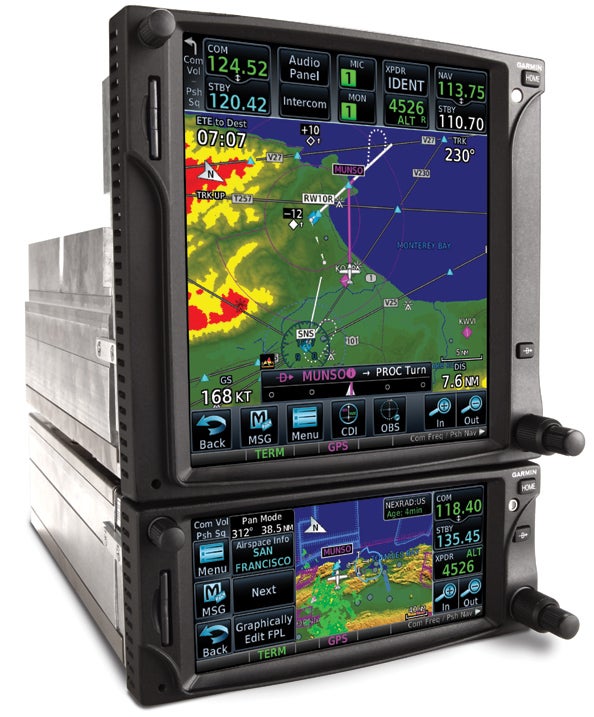
We knew it had to be coming; we just didn’t know when. The “it,” of course, is the long-awaited follow-on product to Garmin’s hugely successful GNS 430/530 series navigators. The new boxes are called the GTN 650 and 750, and Garmin took the wraps off these at the Aircraft Electronics Show in Reno last March. First impression? These products will evolutionize the market with a short list of advanced features, they will likely ignite an intense secondary market in used GNS 430/530 products, and as the world moves smartly toward self-contained EFISes, these may very well be the last products of their kind.
The GTN series could be described as a hybrid of everything Garmin has learned from developing related products, including the yet-to-be-released G3000/5000 series, the aera portables and the stripped-down operating logic the company has adhered to since it launched its first GPS 21 years ago.
The new navigators are heavily touchscreen and menu driven, they have larger improved displays, they’ll interface with anything, they will eventually include voice recognition capability, and, price-wise, they actually come into the market a bit cheaper than their predecessors did, when indexed to inflation. The smaller GTN 650 retails for $11,495, while the GTN 750 retails for $16,995.
Following the trend in consumer electronics, these units do quite a bit more at the same or a slightly lower price. They do not, however, represent the great leap forward that the original GNS 430 did, but rather a large incremental advance.

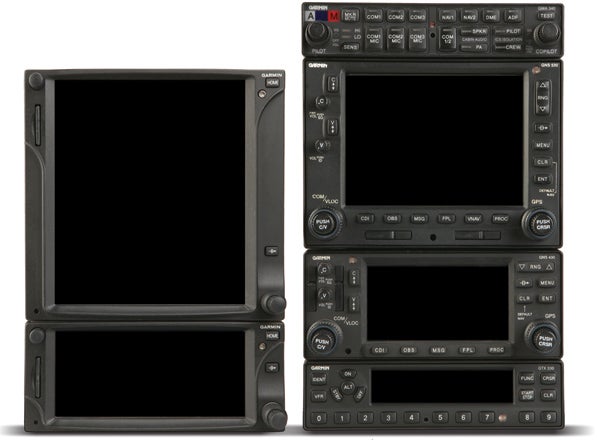
The size of progress. The GTN 750 and 650 (left) provide more capability than the GNS 430/530 right, plus the audio panel, which can be incorporated into the new GTN 750.
The Hardware
In the 13 years since the GNS 430 appeared-yes, 13 years-display, processor and GPS technology have all but reinvented themselves, and the new GTN boxes integrate those advances. They use a variant of the 5 Hz WAAS chip Garmin developed for the GNS 430W/530W, but both the GTN 650 and 750 have new, faster processors with more video capability. The displays remain the TFT technology that’s now industry standard, but the resolution is higher. On the 650, it’s 600×266 pixels, while the 750 has 600×708 pixels. That’s about a fivefold increase in pixel density.
Both screens have 250,000-plus colors, the net effect of which is to render details such as terrain and weather in near-VGA crispness. Where the GNS 530 goes blocky at the midrange scales, the GTN units don’t, though they do exhibit some refresh delay. Both of the new products support Garmin’s 9-arc second terrain capability. Side-by-side with the G600 EFIS, they’re not quite as photo-realistic, but the difference is subtle. Speaking of which, the G600 supports synthetic vision and we asked if the GTN 750 could. Garmin’s Jim Alpiser says that’s unknown, so we’ll take that as a maybe. Our impression is that it has a lot of hooks for future development, even if it doesn’t evolve into some kind of EFIS crossover mutant.

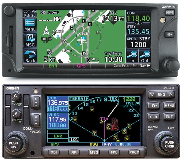
The image above illustrates how Garmin squeezed more screen real estate out of the same size box. The GTN 650, above, is 53% larger than the GNS 430 below. Elimination of 12 of the 430’s 16 keys and knobs helped. Most functions begin with the hard home key on the upper right.
Size-wise, the displays are larger, though this is most noticeable when you look at the previous generation after using the GTN units. The 650’s display is 53% larger on the same size overall box, while the 750 is an astonishing 98% larger in a unit whose display is 6 inches high compared to 4 inches for the GNS 530. (The box itself is not as high as the display, providing space behind the display for a remote audio panel, thus freeing up panel space.)
Garmin gets kudos for not cluttering up these displays with a bunch of extraneous data, and the company deserves more credit for using them to maximize the size of the menu icons and buttons, something that the presbyopic crowd who can afford to buy these things will appreciate. They’re sort of the Reader’s Digest large-print version of navigators.
If you were hoping these boxes might be pin-for-pin slide-in replacements for the 430 and 530, sorry-it’s not to be. They require their own dedicated trays, so installation will be a full-boat deal. However, you can retain the standard Garmin GMA 35 antenna, because the new products will use it, too.

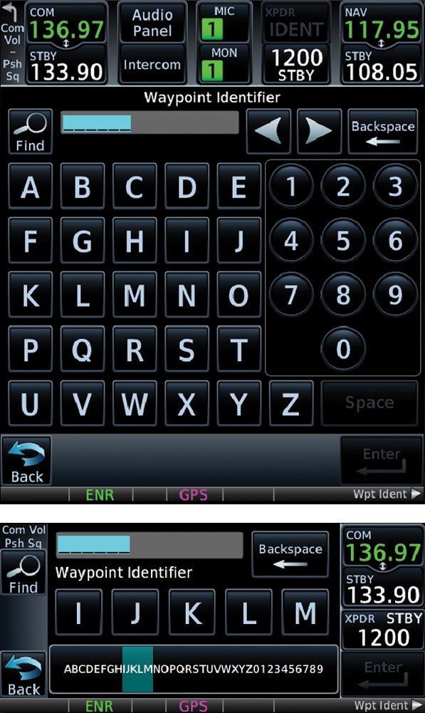
The images above illustrate how the two navigators display the keyboard. The GTN 750 (top) presents a full A-Z virtual pad, while the GTN 650 uses a horizontal slider tape with a zone locator sub-tape below.
The most striking thing about the GTN series is how Garmin got the displays that large. They essentially shrunk the bezels down to the bare minimum by stripping the keys and reverting to a touch-screen-driven operating system. Where the GNS 430 has 16 buttons and knobs-18 if you count the concentric-the GTN 650 has…four, one of which is a concentric. For a veteran 430 owner, this will be disconcerting at first. How the heck do you make this thing play? You need to know just one thing: Push the home key.
The entire operating system (almost) drives through the home key, which, when pushed, pulls up a series of icons that paint a graphic interface glimpse into the boxes’ inner functions. Some of these step through to additional sub-choices. The only familiar dedicated key remaining is the direct-to key, a decision Garmin made because it knows that some users’ overarching knowledge of sophisticated GPS navigators consists entirely of jabbing the direct-to key. The rest of the functions lie unexposed to the light of intelligent life.
Will the menu-driven approach help that? If it doesn’t, Garmin should add a feature to check the operator for a pulse. We weren’t able to do a function-by-function comparison of the GTN’s operating logic with the GNS series, but from what we did see, it’s an amalgam of the aera GUI-driven logic with vestiges of Garmin’s familiar operating system. For example, punching the direct-to key pulls up a screen populated by a waypoint subpage or list, just as with the 430/530.
At this point, you can either scroll in the waypoint you want with the concentric knob, which is so 1998, or touch the “select waypoint” icon and pull up a virtual keyboard to punch it in directly. Want to guess which is easier? On the 750, the key icons are large, and you really have to be fat-fingered to miss a key. There’s no haptic or reiterative feedback, but the touchscreen uses capacitance sensing so its sensitivity is a little less (better) than a bad smartphone, but without the touch-me-twice-please tendency of the resistance-based aera touchscreens.
On the 650, the overall screen size isn’t large enough to accommodate a full A-Z touchpad, so the navigator displays the alphanumerics horizontally in a tape format, which you can finger slide to find the letters or-faster-pick a five-letter zone of desired letters from a compressed A-Z tape below the main tape slider. There wasn’t enough time to compare the two keyboards in depth, but either is a vast improvement over knob scrolling. Also worth mentioning is that you can finger pan or scroll the screen at any time.
At this juncture, you’re thinking…what about turbulence? How are you going to punch those keys in continuous moderate chop? Garmin thought of that, and has molded raised lips into the sides of the bezels and a finger rail at the bottom. These serve as anchor points for your fingers or a thumb or whatever digit isn’t doing the key punching. On our flight trial, we encountered some bumps at low altitude and tried this out. It seems to work, but it’s an acquired skill, and Garmin test flight engineer Grant Wintenborn told us everyone does it differently.
For example, with your ring finger on the right bezel and your thumb on the left, you can peck away with your forefinger, but when you want to hit the back key in the extreme lower left of the screen, now what? Your thumb, that’s what. First time, it takes a little hesitation to figure this out; second time, it’s more natural. Wider field experience will reveal the prehensile limits of the contemporary pilot. Stand by to see how users take to this.
And speaking of the back key, it brings the GUI logic you know from Web browsing into a cockpit navigator. By now, jabbing a back key when you screw something up is almost an autonomic function for the fully evolved man. So it is with the GTN. When you get used to the back key being lower left rather than upper left, backing out of miscommands becomes second nature.
Integration
The reason the back key isn’t upper left is that the com controls are up there on the GTN 750. As it did with the 430/530, Garmin has integrated the com control/display into the main display and without mincing words here, it works way better in the GTN units than it does in the G1000. Com control is utterly intuitive, and there are some nice add-on details.
The com frequencies appear on the top of the display on the 750, on the right on the 650, with the active frequency on top and standby on the bottom. To flip them, just touch the standby window and the two exchange position. Or you can punch the center concentric knob. To key in a frequency, touch the standby window and you get a giant numeric keyboard to punch in the number you want.
Once you’ve done that, the frequency will be in the standby window. At the bottom of the screen, is the choice of “monitor” or “xfer.” The former allows you to monitor the frequency while having the other active, while xfer immediately activates the frequency you just punched in. You can scroll the frequencies in using the inner knob-familiar, but slow.
Where the design inches into the pretty cool is the find function. Like the Mac’s Spotlight, punching the little magnifying glass symbol allows you to search for waypoints by type-recently used, VORs, name, city and so forth. This function isn’t new, but it works better than the previous variant did.
Integrated functions for the transponder and audio panel are similarly in the Goldilocks zone-just deep enough to be genuinely useful and practical, but not too far out there as to pass into the “look how clever I am” navel-gazing realm of software features. The audio panel and intercom functions are especially well designed, offering an easy-to-figure-out capability to split mics, external inputs such as music, volume control via finger sliders and a built-in clearance recorder via the audio panel function. The GTN 750 is designed to work with a new remote audio panel coming this year called the GMA 35, but it will obviously tie into older audio panels, albeit without the integrated control through the navigator. The 650 doesn’t have the remote audio capability.
What’s most intriguing here is that the audio panel will have voice recognition capability for basic commands, and although Garmin didn’t say as much, the navigator itself seems certain to eventually get that capability, too. (See sidebar below).
Flight Plans, Charts
Garmin has significantly improved the flight-planning and charting functions in the GTN boxes. As with everything else, you enter the FP function through an icon on the homepage, and the logic steps you through the options to add each waypoint, popping up the keyboard in context as required. The search function can be employed to find a fix or navaid. Airways are included, by numbered list, and the logic of entering or exiting these is easy to grasp.
But for those of us in a hurry-isn’t that everyone?-the GTN units have a GUI rubber-band feature. Here’s how it works: If your course is depicted via the magenta line from A to B and you want to go via C, just touch the “graphically edit FPL” icon, drag the line where you want it, and the line snaps to that point, automatically adding it to the flight-plan list. But what if you move the line into a congested area on the map? How can you control where it snaps? Garmin thought of that, too. The line has sort of an interrogatory function. If there are several snap candidates within range, it will pop up the list as touchable icons, and you tell it which you want. This includes airways around a VOR or intersections. (Hey, someone actually tested this stuff.) Also, where the GNS boxes didn’t detail flight plans with intermediate and cumulative distances and time, the GTN boxes do. If you want to add an approach or arrival to your rubber-banded flight plan, you do that through the regular flight plan function page, accessed from the homepage. Looking forward, Garmin says the GTN boxes are “ADS-B friendly,” meaning they have the hooks for NextGen tie-ins.
While the GNS displays lacked the resolution to include paper charting functions, the GTN displays have this as standard fare. Impression? Not bad, but not great, either. They still do what these devices have been doing from day one: adapting the electronic screen to the limitations of a paper approach plate.
No slam on the GTN that it does this as well as can be expected-maybe better than expected-but other than selection and interoperability improvements, the GTN units haven’t advanced the cause fundamentally, and we doubt they will until the industry abandons its hidebound attachment to paper.
The GTN 750 can be ordered with either Garmin’s FliteCharts or Jeppesen’s Chartview. The latter will georeference aircraft position on the chart right out of the box; the former will get that capability in a future software revision. Either way, Garmin’s SafeTaxi feature is standard. Data cost is about $1000 a year for 28-day revision for everything in the cockpit, not just the GTN.
Conclusion
These two products are exactly what you might expect. They represent a substantial, incremental improvement over the GNS line, but they aren’t revolutionary in capability. They are, after all, selling into a replacement retrofit market. OEM sales will likely be minimal, because few new airplanes have displays that require external nav/coms. If it’s not a single-box, fully integrated solution by now, it soon will be.
Let’s qualify that with this observation: The GTN units are revolutionary in one aspect. They will be easier to learn. You really shouldn’t need to crack the POH much to either make this thing play the basic notes or to even master them at Ninja level one. Ergonomically, they’re as good as we’ve seen yet.
Garmin says it will continue the GNS 430/530 line for another couple of years, but we’re hard-pressed to see why anyone wouldn’t buy the GTN 650 or 750 instead. It’s a slam dunk. Looking to upgrade a 430 or 530? Slam dunk again, for the GTN series.
For the bottom feeders, Garmin has just thrown a megabucket of chum into the open sea. It’s not offering any trade-in deals, so it has no interest in bringing the old boxes back to Olathe for a one-way trip to the crusher. That means dealers will have some flexibility on trade-ins, and a lively secondary market in used 430s and 530s will eventually kick in. But is buying one of these pre-owned units a reasonable thing to do given their inevitable obsolescence? Indeed, it is.
Garmin says these products have at least another 10 years of support life in them, and given that there are so many out there, we suspect they’ll be supportable for longer than that.
If the GTN series hit its stride as quickly as the GNS 430 did, we expect to see a lot of older aircraft sporting a pair of 430s bought on the cheap. And that’s not a bad thing.
For more information, call 800/800-1020 or visit www.garmin.com/aviation. For two videos on the GTN series, visit www.avweb.com and select the video index. Then scroll down to the GTN navigator to review videos.


